The Design Problem
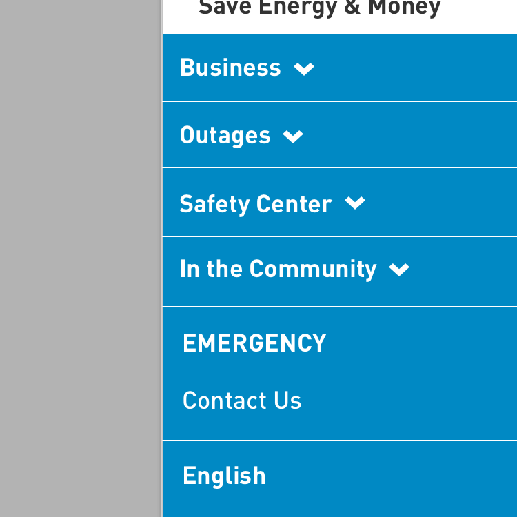
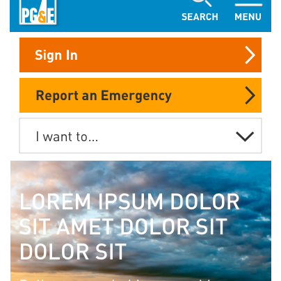
PG&E's old website was not responsive. There were two separate platforms for Desktop and Mobile applications. The integrated web project was brought about to 1) provide a consistent and unifying navigation across the mobile and desktop web platforms; and 2) have key pages such as the sign in page home page be designed and developed using a Bootstrap responsive framework. This was an interim refresh of the pge.com website before we roll out with a fresh new experience. This went live in January 2016.
Prior to this page, there were two different login pages, one for the mobile platform and one for the desktop platform. The desktop sign in page was not responsive. There were some usability issues with the mobile platform sign in page, as users became confused about which login to use - either the regular login block or the one-time access login block which were both presented to the user on the same web page.
I was tasked with designing the user experience and providing the art direction for the sign in page for the desktop, tablet and mobile breakpoints. Working with Product Management and IT, I designed a responsive sign in page that was easy to use and provided a space for marketing copy to extol the virtues of registering for a PG&E My Energy account.
My Account Sign In Page
Desktop Breakpoint
Tablet Breakpoint
Mobile Breakpoint
