Accessibility and Responsive Redesign of PG&E Website
In 2015-2017, I was part of the PG&E team that participated in a comprehensive redesign of https://www.pge.com to make the outdate website fully accessible and fully responsive.
My Role
I was a Principal User Experience Designer in the Digital Strategy Group at Pacific Gas and Electric Company. As a Principal User Experience Designer in the pge.com redesign,
Design Problems
Problem #1 - Lack of Accessibility
In 2011 Pacific Gas and Electric Company was sued for lack of accessibility in it's website. What that means is that people with disabilities had trouble accessing the website using accessible technologies. Pacific Gas and Electric Company settled with the plaintiff. The settlement detailed that Pacific Gas and Electric Company would have to make their website accessible according to the WCAG 2.0 requirements and meet Conformance Levels A and AA. All the content on the website, including PDF's, videos, and html content would have to be accessible.
Problem #2 - Lack of Responsive Design
The other component of the redesign was making the pge.com website completely responsive. Prior redesigns had fallen short, with only key pages and key applications responsive, and lacking focus on desktop or tablet breakpoints. The content management system system and design templates had not been updated in several years to support responsive design nor accessibility. The last redesign had been in 2010 and supported only desktop breakpoints. There were different visual styles and themes in use across the website. There was no comprehensive look and feel.
Problem #3 - Excessive Content
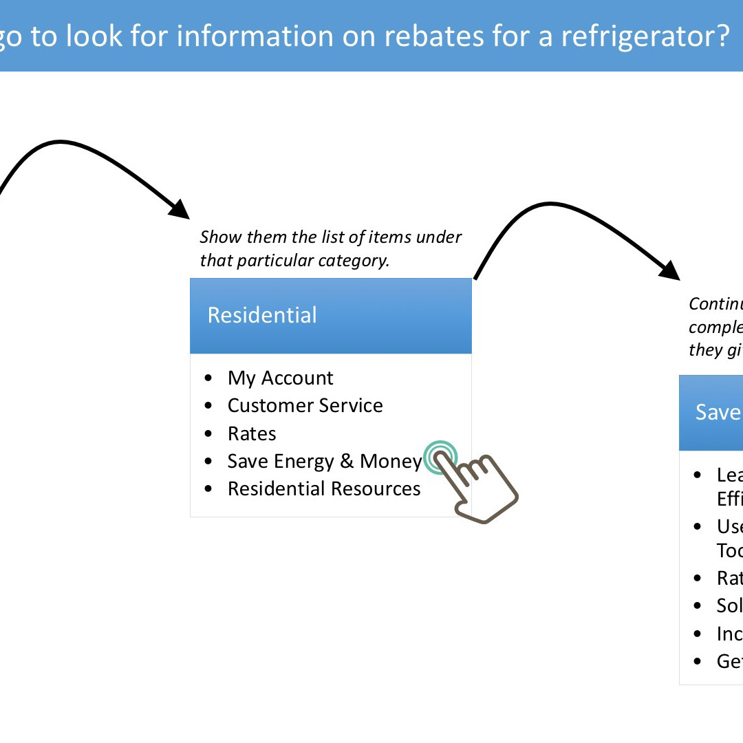
In 2014 the pge.com was over 4000 pages. It supported a variety of customers, including residential and business. The website information architecture was very complex. Customers had trouble finding information.
Problem #4 - Lack of Resources
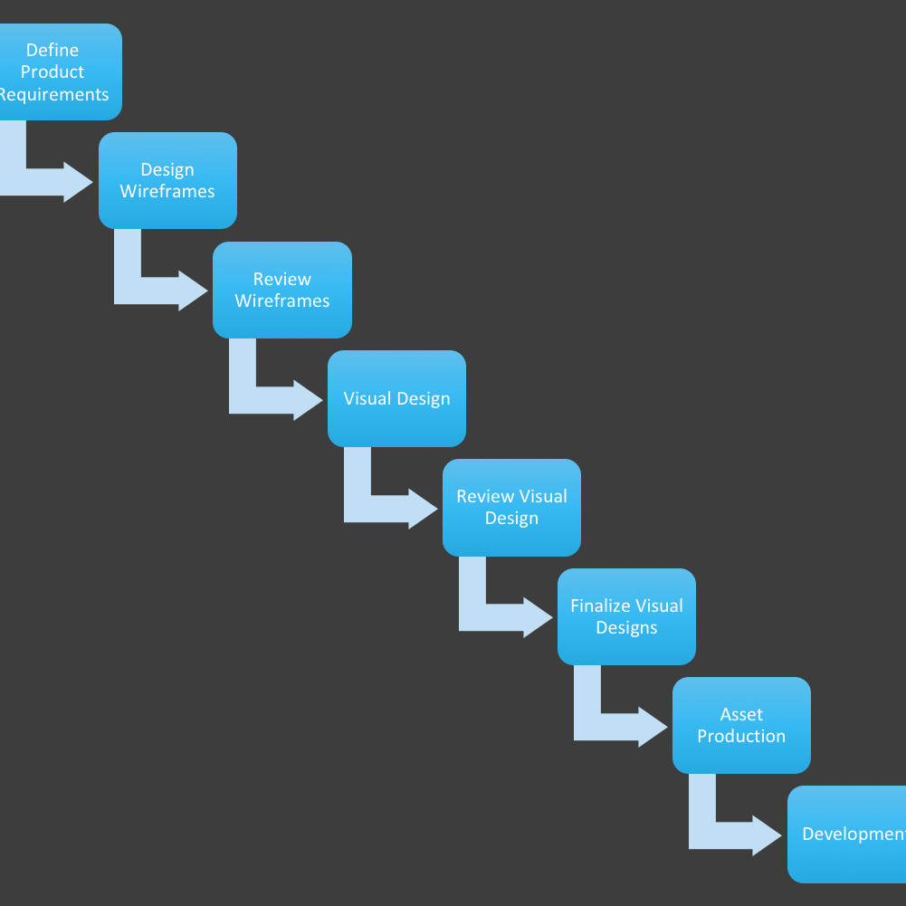
Redesigning a large scale content and application website is a comprehensive endeavor. PG&E lacked the internal staff to redesign and redevelop the website. Most staff within the digital strategy and IT organizations were focused on day to day tasks. Many lacked the knowledge and experience of responsive design and accessibility. However, redesigning a website is a collaborative task and involves many resources. It takes more than one person - it takes a team. The redesign process was over a two year process. The website had to be analayzed, tested and requirements had to be put together. To redesign the website, PG&E engaged Sapient, a design consulting firm. While Sapient provided designs, the Digital Strategy team reviewed the designs and provided feedback to guide the Sapient team towards providing PG&E customers with the best possible experience. Once Sapient finalized the designs and started release code, the Digital Strategy team conducted numerous tests for usability, QA and accessibility.
Design Solution
User Centered Design Activities
Before Redesign
Before the redesign, there were several theme in use across the website and the content management. Residential had one visual theme, whereas the Business section had another.
After Redesign
After the redesign, there was a consistent theme used across the website. The website was fully responsive, and full accessible and compliant with WCAG 2.0.
The website redesign returned the website to 1st place in the 2017 Esource study of 114 North American utility web sites.
A massive redesign of a very large website is a team effort, and everybody has a role to play. There is more to a redesign than just the 'glossy' visuals. A lot of analysis, preparation work, user research, design reviews, and testing go into the process.


