The Problem
PG&E's website was not responsive. There were two separate platforms for Desktop and Mobile applications. The integrated web project was brought about to 1) provide a consistent and unifying navigation across the mobile and desktop web platforms; and 2) have key pages such as the home page be designed and developed using a Bootstrap responsive framework. This was an interim refresh of the pge.com website before we roll out with a fresh new experience. This went live in January 2016.
The prior home page had been redesigned by several different teams, and had lost cohesivity and focus, both of the user experience and of the brand.
The Solution
I was tasked with designing the user experience and providing the art direction for the home page for the desktop, tablet and mobile breakpoints. Working with Marketing, Brand, and IT, I designed a web page that emphasized the qualities of the PG&E brand but provided the user with a better home page experience, as it was easier to read, was designed with accessibility principles in mind, and a user could access the unified experience across desktop, tablet and mobile.
PG&E Home Page - Mockups
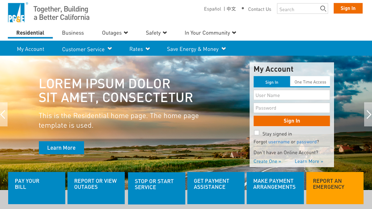
Desktop Breakpoint
Tablet Breakpoint
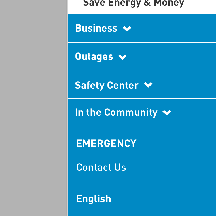
Mobile Breakpoint

PG&E Home Page - Screenshots of implemented website
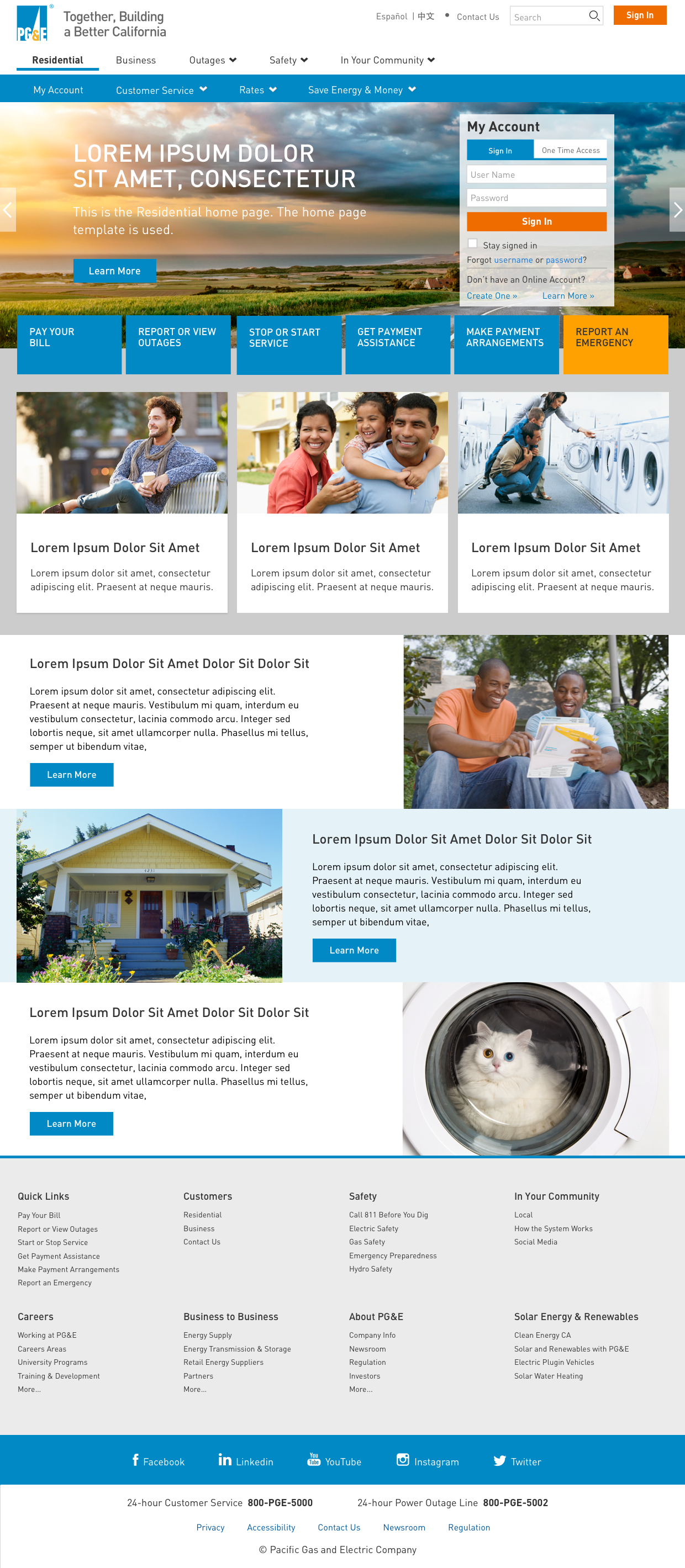
Desktop breakpoint
Tablet Breakpoint
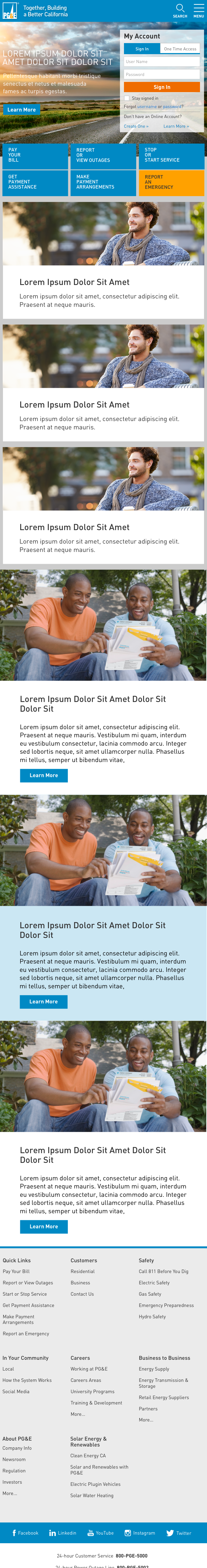
Mobile Breakpoint

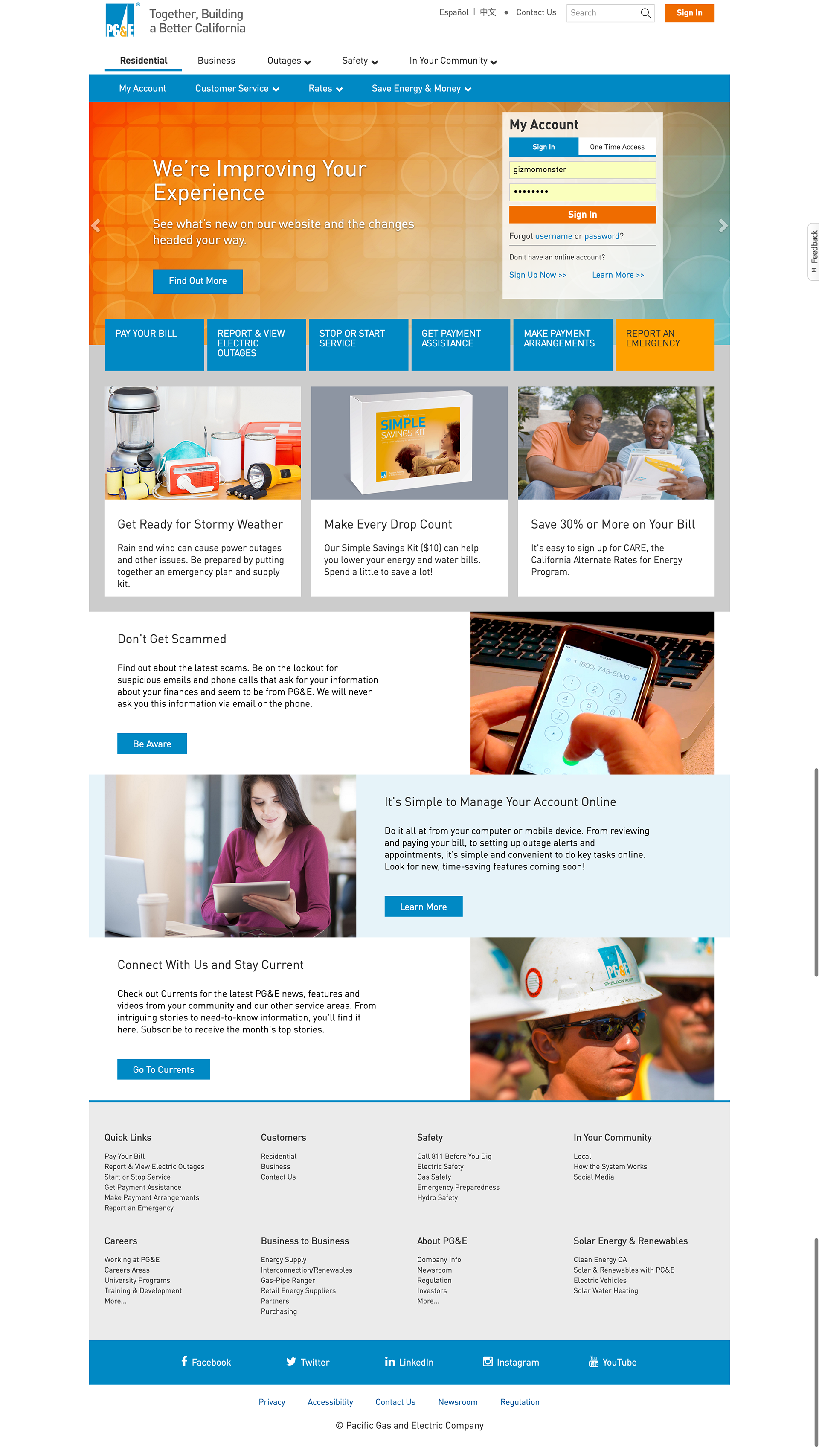
Prior Homepage before Redesign
